Table of Contents
Explore Blogs
Trending on Ebook
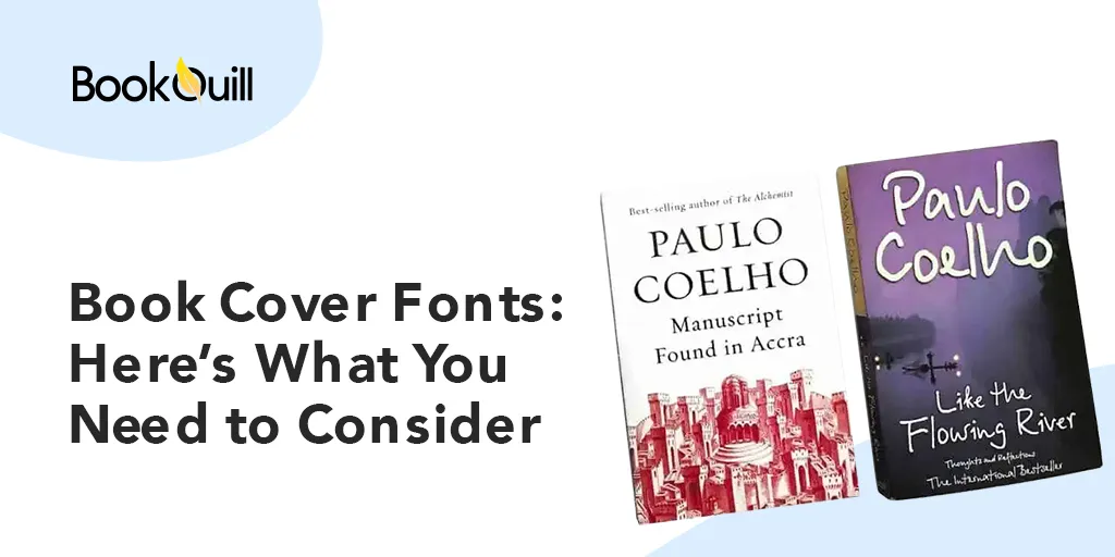
Book Cover Fonts: Here’s What You Need to Consider

The book cover is the potential audience’s first impression of the book. But why is this stressed so much? Why does the author need to have an appealing book cover to attract its its target consumer? While, it is one great way to convert prospective leads into successful book sales, it is still quite tricky on its own.
Especially, when an author wants to take the self-publishing route. Because an eye-catching book cover can make or break the customer’s purchase decision. So, how exactly how does one make their book cover stand out? What elements should design professionals take care of? To begin with, book cover page design is integral for an author and definitely does not belong to the sides.
Which brings us to the most dominant feature: typography.
A. A Brief Outline About Typography
Ask any author and they will not make much fuss about the typography used on the cover page or inside the book either. Yet, typography DOES play an important role, making the book stand out. That’s because typography is an art in itself.
It uses a single (or even multiple) font styles to make the text appealing to the reader, while also being legible when put on display. One can see this via several different factors.
Like the selection of relevant typefaces or spaces between different letters, for starters.
B. Here’s Why Your Chosen Font Style Matters For Your Book
Wondering what font is best for a book? Which book cover fonts can make your book stand out and make it a success? Or why good font is essential for every author?
Let’s dig right into it:
-
A Good Font For Book Cover Enhances Reading Experience
Every reader has a set of books that they can read again and again, without ever getting bored of them. It could be that the story plot fascinated them. Maybe, the characters and the world set up by the author completely immersed them. Or, they were just simply mesmerized by the attractive cover and decided to check out the book?
No matter what the reason is – you do wonder why you can’t stop reading some books. Well, this is also because the team behind the book – use a few tricks of their own. For instance, take fonts for book cover. Like fantasy book cover fonts.
A reader doesn’t have to be a design whizz to marvel them. The innovative aspect and the intricate finesse of the design would catch anyone’s eye. Make them scan the back of the book for further information.
Take another example – pick a self-improvement book. Notice the font style used by the book design team for the text inside the book and for its cover page. The style used inside is easy on the eyes. Making the text, simple and trouble-free to read for the average reader. The same rule is applied to the external: the book cover fonts used on the front, amp up the book’s appeal.
One doesn’t need to have a design bone in their bone. Nor is it complicated to learn. But understanding the book design process does have an advantage. In fact, it can become a great tool if the author is thinking of taking the self-publishing route, for it is a major factor that can enhance reading experience.
Experiment with free book cover fonts and understand how the whole process works. Once you get the hang of it, you be better able to understand the varying nuances of it. If you still think that there’s room for improvement then get the creative professionals involved.
-
A Stellar Book Title Font Enhances the Charm of Your Book
Your cover page is the first thing that any potential reader sees when he picks up your book. This means that an author should never underestimate the importance of the various design elements found on the front and back of the book.
Moreover, your book design should also not ignore factors such as genre or target audience. No wonder, the domain of book cover design is constantly evolving. No longer willing to take a back seat, book design today receive as much attention as the book content inside.
That’s only because a good book title font is the first thing that catches a reader’s eye when they pick up a book. Also because, a book cover helps to enhance a reader’s experience. Take children’s books, For instance. They have a relaxed feel about them and reading them transports the reader back to the past innocent joys of their childhood.
Pick any Dr. Seuss’s books and you are bound to notice: one, the book title font is big and loud despite being simple. This goes on to show that design design simplicity, the books have a larger-than-life personality that matches the vibrancy of the content inside.
-
The Right Font Style Encourages A Look From the Visual Perspective
Most people underestimate the power of the font style used. The perfect font is one of the features that make sure the reader doesn’t put the book down. This goes both ways. Whether you have taken the conventional route and gotten the creatives involved or want to do everything on your own on the self-publishing road.
Understanding design essentials always helps. And why not? Something as simple as selecting a font styles for the different sections of your book. Such as selecting the right book cover font, for instance, can help you take a good look at the text – from the visual perspective.
Thus, to make sure that blocks of text don’t overwhelm the reader or easily distracted otherwise. Instead, they increase the reading pace exponentially, since the text feels familiar and comfortable to the eye. Take the example of the non-fictional publication: Architectural Digest at 100. The written documentary utilizes professional fonts like Helvetica or Times New Roman. Its stoic yet professional look is further enhanced by the sober color scheme that convey a formal, crisp, and serious tone to the reader.
C. Understand Styles For Best Book Cover Font Design
Moving ahead, you can’t work with choosing book fonts styles if you don’t understand them. Why is this essential? Well, your chosen font needs to synchronize with the book design base. What this means is that the title fonts used on the cover will always be different from the font that’s used for the text inside.
Let’s find out what other aspects you should consider when selecting a font style. Read below to find out:
-
Use A Mix of Free and Paid Font Styles
Always pay attention to factors like: is the chosen book cover fonts – free, paid, or do you need to pay for just a part of it? No matter what option you choose, DO pay attention to this one legal bit. Just like you would never want anyone to claim your book as theirs, the same applies to your selected font style.
Most fonts today especially the paid ones, come with an anti-theft feature. That’s why if someone does try to be crafty, they still won’t be able to embed the font in their design, as they want. However, if you are unsure of your selected font then choose one that has clearly stated its policies.
-
Assess A Font By Its Usability
The significance of the usability factor can simply not be undermined, even by an amateur designer. However, this is dependent on the context of the subject matter of the book as well. For instance, a sports memoir or an autobiography would use fonts like Helvetica, Tangerine, and Garamond to name a few.
However, if you are writing romantic fiction or a horror novel then the fonts for book cover would be very different. This applies if you are tempted to use a font with a funky name. Assess whether it is suitable or not. Does it corroborate with the theme, genre, and target audience of your book?
If yes, then move forward with it. If not, select one that represents the varying elements of your book with much ease. This advice applies even if your selected book cover fonts free and is versatile, design-wise. Thus, easily combining the elements of aesthetics for to boost readability for convenience. Select fonts that are different for the cover page and for the inside text.
-
Know Your Typefaces
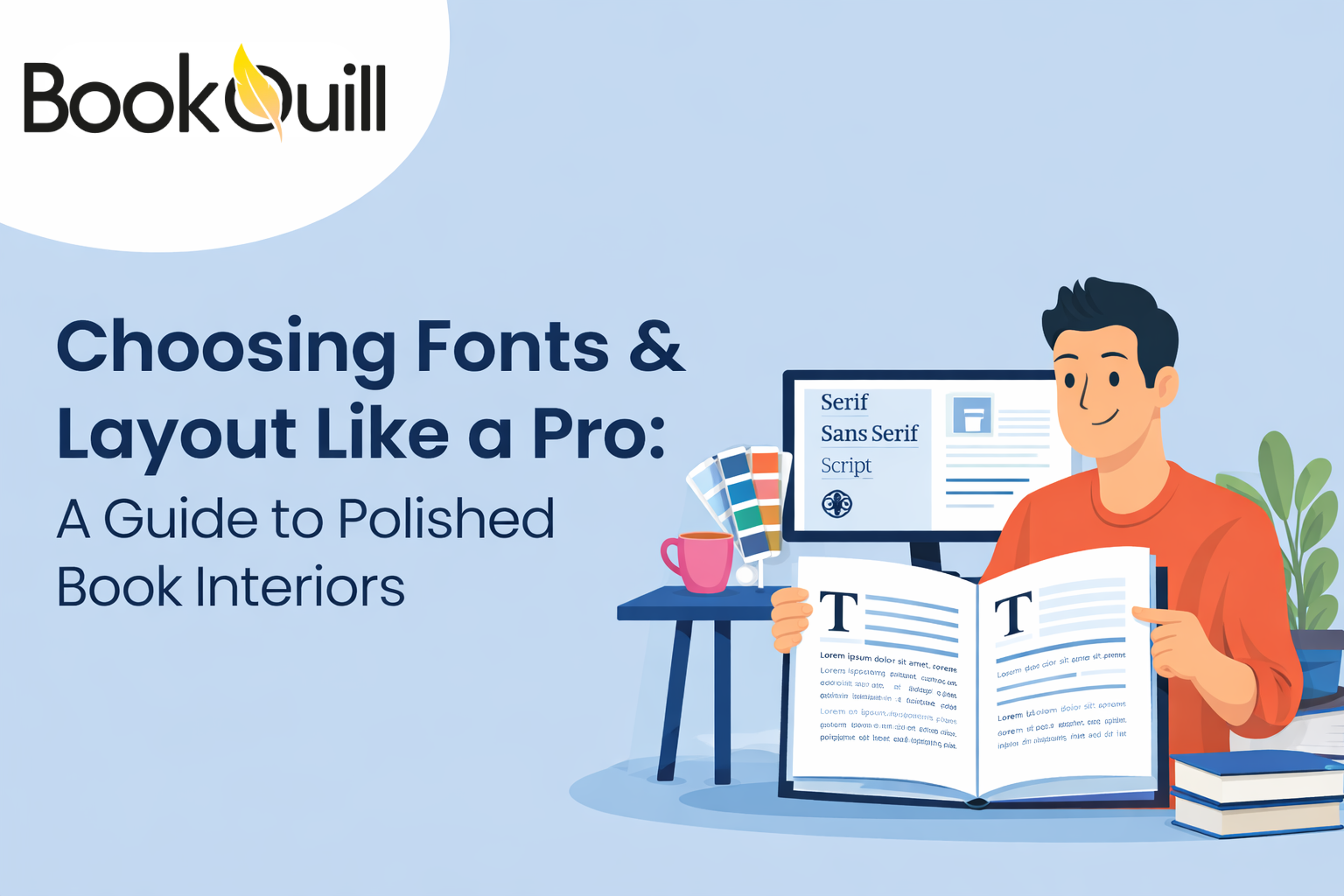
Many design services like the book design team at BookQuill believe that everyone should know a bit about design basics. Such as the various font families and how each one of them is used within the book. Let’s take the five different kinds of typefaces:
-
Serif
Serif fonts are those that may have a taper or decorative lines. These are also known as feet or tails. Characters using the serif typeface, normally are thick and look like blocks piled. These may come across as blunt and rounded like Courier or look angular like Rockwell.
The serif type has an antique feel. Thus, reminding the reader of the fonts used during the early publishing stages – before the 19th century or so.
-
Sans-serif
On the opposite side of the spectrum is sans-serif. This is a better option for body texts for its considerably readable. Thus, Sans serif fonts are cleaner and simple minus the extra width as noticed in the other. These are ideal for people, who may suffer from weak or poor vision.
Popular examples of sans-serif fonts are Arial, Verdana, and Helvetica.
-
Monospaced
A monospaced font is single-sized, meaning that characters under this typeface, have narrow column spaces. These are usually used in technical documents, like in manuals and coding documents, for instance. Ideal for programming and are often used to differentiate code from normal text.
That’s why, monospaced fonts are considered best for short texts.
-
Script
Script is a regular font and comprises of characters in wide columns. They are visually elegant, resembling a person’s handwriting. That’s why they are perfect if placed in headings like book titles, for instance.
-
Display
Another eye-catching font is display fonts, which are considered perfect for large spaces, such as book titles. Take the book cover design of the Twilight Series. The front cover denotes the subject matter of the book. Then look at the various font styles used.
D. Ready to Choose the Best Book Cover Fonts?
Once you decide which font pairs you want, it will be easier to move. Selecting the right book cover fonts for the main title page are extremely IMPORTANT. Here are some case studies to prove why you need to pay attention to these!
Let’s dig further:
1) Case Study #1: The Great Gatsby by F. Scott Fitzgerald
Release Date: 1925
This book is a great example of a modern classic. Released within the early 20th century, its cover page perfectly illustrates the essence of the novel. The title uses a font with elegant script that’s inspired by the art deco decadence and the sophistication of the era. Since this is exactly what the novel projects within its pages!
This is further captured by the use of gold within its cover design that also successfully represents the various themes, mostly style, luxury, and materialism that’s also present.
2) Case Study #2: The Hunger Games by Suzanne Collins
Release: 2012
Known for its bold dystopian landscape, the book cover of The Hunger Games reflects its action-based plot. Sans-serif is used in uppercase letters in the title font for maximum impact. The idea is to showcase the two qualities that characterize the novel: high-octane tension and massive strength.
The cover design successfully achieves that. This is followed by the atmosphere of urgency and intense drama all rolled into one that is illustrated via the black font against the fiery hot background.
3) Case Study #3: The Fault in Our Stars by John Green
Release: 2014
One look at the book cover fonts used in the novel, can tell anyone that this is a contemporary YA romance. The book title font uses a handwritten font style, placed within two clouds of contrasting colors. Set against a blue background, it aims to form an emotional connection with the reader.
Despite the inclusion of a cursive font or the soft color palette, the overall book cover design is uncluttered and quite simple, perfect for a young romance.
The Final Word
The publishing industry has become competitive with the passage of time. That’s why authors need to go the extra mile and aim to leave an unforgettable first impression on both the editor and the target audience. This is where factors like book title fonts, color palettes, book theme, and several others come in.
The goal is to create a cover that instantly catches the attention of the audience so that they easily move to the next stage of the reading process, i.e. convert leads into successful book sales.
Frequently Asked Questions (FAQs)
Q. What should you consider when selecting a book cover font?
It is essential to select a book cover font that has some of the following characteristics:
-
- – Matches the genre of your book
- – Sets the right expectations for the target reader
- – Entice reader and form an emotional connection
- – Boost book sales
Once you have covered the essentials, it should help to set the right tone for you.
Q. How many fonts can be used on a book cover?
For a book cover, stick to one fancy, decorative font style and keep the others simple and basic. This way, the book cover should have a balanced look without overwhelming the reader with too much text or becoming a distraction in itself.
Q: What are the best fonts for book covers?
The best fonts for book covers depend on the genre and tone of the book. Here are some popular choices:
- Serif Fonts (e.g., Times New Roman, Garamond) – Great for historical or literary fiction.
- Sans-Serif Fonts (e.g., Helvetica, Arial) – Ideal for modern, clean designs.
- Script Fonts (e.g., Pacifico, Great Vibes) – Perfect for romance or elegant books.
- Display Fonts (e.g., Bebas Neue, Impact) – Bold and attention-grabbing for thrillers or action books.
Choose a font that matches the book’s theme and appeals to your target audience.
Q. What size font for book cover design?
When it comes to font size, a single typeface or even two, are considered ideal for book covers. However, having more than two, may just create confusion for the reader.


