Table of Contents
Explore Blogs
Trending on Ebook
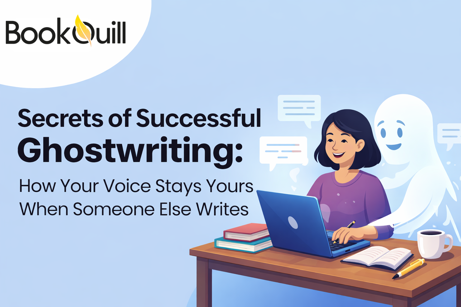
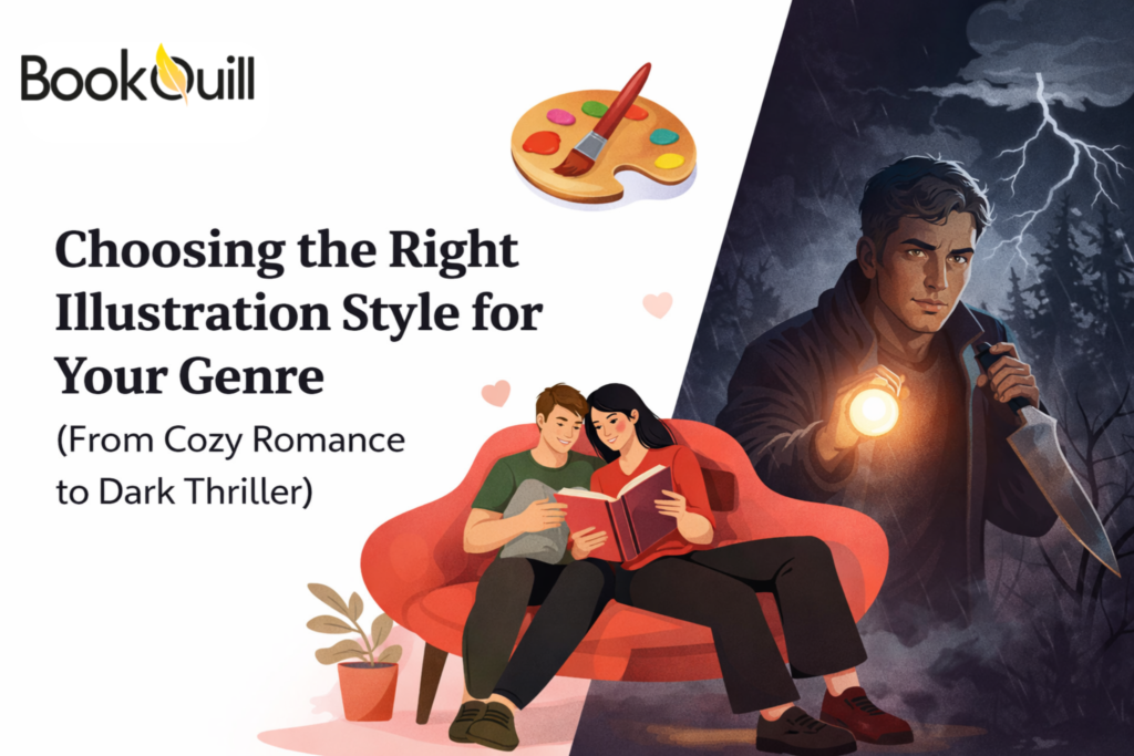
Choosing the Right Illustration Style for Your Genre (From Cozy Romance to Dark Thriller)
Before a single word is read, the visuals already tell a story. They signal mood, genre, audience, and even quality. Whether you’re an author, publisher, or entrepreneur, choosing the right illustration style isn’t just about aesthetics but about communication, marketing, and reader trust.
From soft watercolor scenes in cozy romance to high-contrast, unsettling visuals in dark thrillers, illustration plays a powerful role in shaping how a story is perceived. Here, we’ll break down how to pick it.
Key Takeaways
- Illustration Style Is a Genre Signal – Your illustration style tells readers what kind of story they’re getting before they read a single word. Colors, line quality, and composition instantly communicate genre. When the illustration matches genre expectations, readers feel confident choosing the book, which directly impacts discoverability, trust, and sales performance.
- One Illustration Style Does Not Fit All Genres – Different genres require different visual approaches. Cozy romance needs warmth and softness, while dark thrillers demand contrast and tension. Using the wrong illustration style confuses readers and weakens marketing. Understanding genre-specific illustration design ensures your book visually belongs in its category.
- Professional Illustration Is About Strategy – Professional book illustration services do more than create attractive images. They understand reader psychology, market trends, and platform requirements. Their work is strategic, designed to perform well as thumbnails, print covers, and promotional assets. This makes professional illustration a business investment.
- Simplicity Often Outperforms Detail – Many authors believe more detail equals better illustration, but that’s not always true. Simplified or symbolic illustrations often create stronger emotional connections and better readability at small sizes. Effective illustration design focuses on clarity, mood, and impact rather than unnecessary complexity.
- Children’s Books Require Specialized Illustration Knowledge – Children’s book illustration services are unique because they rely on visual learning principles. Color contrast, character scale, and visual storytelling must align with child development stages. Illustrators without children’s publishing experience often miss these details, reducing engagement and comprehension for young readers.
- The Right Illustration Improves Sales and Branding – A well-chosen illustration style strengthens your book’s brand, increases click-through rates, and improves shelf appeal. Readers are more likely to trust and remember books that visually align with genre standards. Strong illustration design also helps create consistent branding across series and future releases.
What Is an Illustration?
An illustration is a visual interpretation of a concept, story, or idea created to enhance understanding, emotion, or engagement. Unlike photography, illustration allows complete creative freedom, such as characters, worlds, moods, and symbolism can be shaped exactly as the story demands.
In Books, That Purpose Might Be
- Capturing genre expectations
- Supporting narrative themes
- Appealing to a specific age group
- Enhancing readability and emotional depth
Good illustration Design Considers
- Color psychology
- Line quality
- Composition
- Character style
- Cultural and genre conventions
The illustration that works beautifully for a children’s book would feel completely wrong for a psychological thriller.
Types of Illustration Used in Books
Before choosing a genre-specific style, it helps to understand the main types of graphic illustration commonly used in publishing.
Realistic Illustration
- Detailed, lifelike visuals
- Common in historical fiction, biographies, and some thrillers
- Focuses on accuracy and emotion
Semi-Realistic Illustration
- A blend of realism and stylization
- Popular in fantasy, romance, and YA novels
Cartoon or Stylized Illustration
- Simplified shapes, expressive characters
- Common in children’s books
Minimalist Illustration
- Clean lines, limited color palettes
- Often used in literary fiction or modern romance
Abstract Illustration
- Symbolic, conceptual visuals
- Works well for poetry, experimental fiction, or psychological genres
Dark or Gritty Illustration
- Heavy shadows, dramatic contrast
- Ideal for horror, crime, and dark thrillers
Each of these types sends a different message, and choosing incorrectly can confuse readers.
Why Illustration Style Must Match Your Genre
Readers make split-second decisions. When browsing online or in a bookstore, your illustration is doing the selling before the synopsis ever gets read.
If your style doesn’t match your genre:
- Romance readers may skip your book
- Thriller fans may misjudge tone
- Parents may avoid children’s books that feel off-brand
This is why authors often turn to top book illustration services as they understand how visuals align with genre psychology.
What to Do Before Choosing the Style of Illustration for Your Book
Step 1: Define Your Core Genre
Before choosing an illustration style, clearly define your book’s core genre. Be honest about where your story truly belongs, not where you wish it could fit. Each genre has visual expectations readers instantly recognize. Trying to cross styles without understanding those expectations can confuse your audience and weaken your book’s appeal. A clearly defined genre gives your illustration direction, consistency, and stronger market alignment.
Step 2: Identify Your Target Reader
Knowing your target reader is just as important as knowing your genre. Consider their age, reading habits, emotional expectations, and familiarity with the genre. A young adult audience responds differently to illustration than adult nonfiction readers. When illustrations match reader preferences, they create an instant connection and trust, making your book feel designed specifically for the people most likely to buy it.
Step 3: Study Market Standards
Before finalizing any illustration style, study bestselling books in your category. Pay close attention to color palettes, character styles, layouts, and overall tone. Market standards exist because they work. This doesn’t mean copying, but understanding patterns helps you design illustrations that feel familiar yet fresh, ensuring your book visually fits successful titles in your genre alongside.
Step 4: Decide on Tone
Your illustration style must reflect your book’s emotional tone. Ask yourself whether your story is comforting or disturbing, lighthearted or intense. Illustration communicates mood instantly through color, contrast, and composition. A mismatch between tone and visuals can mislead readers. When tone and illustration align, readers intuitively understand what kind of experience your book offers.
Step 5: Work With Professionals
Choosing the right illustration style often requires expert guidance. Professional book illustration services understand genre expectations, reader psychology, and publishing requirements. They help translate your story into visuals that perform well across formats and platforms. Working with professional book illustration services reduces costly mistakes and ensures your illustrations support both storytelling and market success.
Illustration Style Recommendation According to the Genre
Let’s explore how the style of illustration changes across popular genres.
1. Cozy Romance
For cozy romance, the illustration should instantly feel warm, safe, and emotionally inviting. Soft, hand-drawn or watercolor-style illustrations work best. Colors should lean toward pastels, warm neutrals, blush tones, creams, and gentle greens. Line work should be rounded and imperfect rather than sharp or highly polished.
Characters are often simplified rather than hyper-detailed. Backgrounds such as cafés, bookstores, small towns, gardens, or countryside scenes help reinforce the cozy feeling. Minimalist illustration design also works well when paired with typography.
Many authors think romance illustrations must always show people, but those who actually know what does illustration means will do something else. They will choose symbolic illustrations, like a teacup, a window view, or a cozy interior, which often perform better because readers can project themselves into the story. Overly detailed faces can reduce emotional connection instead of improving it.
2. Contemporary Romance
Contemporary romance thrives on clean, modern illustration design. Flat or vector-style illustrations with bold but controlled color palettes are popular. Characters are usually stylized rather than realistic, with expressive poses and simplified facial features.
Negative space is important here. Clean compositions feel current and align with modern romance branding. These illustrations often blend seamlessly with typography, creating a polished, market-friendly look.
Contemporary romance illustrations are heavily influenced by social media aesthetics. Many top book illustration services intentionally design covers that look good as thumbnails and Instagram posts, not just as full-size covers. This directly affects discoverability and sales.
3. Fantasy
Fantasy illustration should feel immersive and detailed. Semi-realistic to realistic illustration styles work best, with rich textures, dramatic lighting, and layered environments. Costumes, architecture, and landscapes must feel intentional and believable within the world.
Color palettes are usually deeper, such as emeralds, golds, blues, and shadowed neutrals. This depends on whether the fantasy leans epic, dark, or whimsical. Fantasy illustrations fail most often because of inconsistent visual logic.
Readers subconsciously notice when armor, magic effects, or environments don’t follow a clear internal rule. Professional book illustration services often create hidden “visual systems” to keep fantasy worlds consistent, even across multiple books.
4. Young Adult
YA illustration focuses on emotion, identity, and mood. Semi-realistic or stylized character illustrations work best, often combined with symbolic elements like light, shadows, or abstract shapes.
Colors are emotionally driven, like purples for mystery, blues for introspection, and reds for intensity. Characters are expressive but not overly detailed, allowing readers to relate easily.
YA readers respond more strongly to body language than to facial detail. Many top book illustration services intentionally reduce facial realism and focus on posture, motion, and silhouette to create stronger emotional engagement.
5. Children’s Books
Children’s books prioritize clarity, color, and storytelling. Styles are usually cartoon or highly stylized, with bold outlines, bright colors, and expressive characters. Illustrations must clearly show actions, emotions, and cause-and-effect relationships.
For younger children, simplicity is necessary, or else they will not understand what’s in the book. For older children, illustrations can become more detailed while still remaining friendly and readable.
Illustrations for children are designed around visual learning stages. Professionals adjust color contrast, spacing, and character scale based on how children’s eyes track images. This is why experienced children’s book illustration services are critical; this knowledge isn’t obvious but deeply affects engagement.
6. Mystery
Mystery illustrations should intrigue without revealing too much. Muted color palettes, subtle shadows, and symbolic imagery work best. Instead of showing characters clearly, many mystery illustrations focus on objects, environments, or partial scenes.
Composition should feel slightly off-balance to create tension. Minimalist design made by the best book illustration services often works better than detailed scenes.
The most effective mystery illustrations often avoid the main character entirely. Readers are more drawn to covers that hint at secrets rather than explain them, which increases curiosity and click-through rates.
7. Dark Thriller
Dark thrillers require high-contrast illustration styles with deep shadows, strong lighting, and limited color palettes. Black, gray, red, and cold blues dominate. Graphic illustration here is thoughtful and precise. Every element should serve tension. Textures such as:
- Grain
- Rough Brush Strokes
- Stark Line Work
This adds psychological depth. Too much darkness can hurt sales. The best professional book illustration services carefully balance darkness with clarity so the image remains readable at small sizes. Overly chaotic visuals reduce trust rather than increase fear.
8. Horror
Scary illustrations often use distorted forms, unsettling compositions, and negative space to create a sense of imbalance and unease. Hand-drawn or mixed-media illustration styles are especially effective in horror, as their imperfect lines and rough textures feel more human, raw, and unpredictable than overly polished digital art.
Color choices in horror illustrations are usually restrained and intentional. Instead of bright or varied palettes, horror relies on blacks, grays, muted reds, sickly greens, or cold blues. These limited colors allow texture, shadow, and shape to do the emotional work. Subtle gradients, grain, and visual noise increase discomfort without overwhelming the viewer.
What many people don’t realize is that horror illustration rarely shows the monster clearly. Suggestion is far more powerful than exposure. Shadows, partial figures, silhouettes, or symbolic objects activate the reader’s imagination, which creates deeper fear than explicit imagery.
This is why many top book illustration services design horror visuals that hint at danger rather than explain it. By leaving space for interpretation, the illustration becomes psychologically engaging, making the fear feel personal and lingering rather than momentary.
9. Nonfiction & Educational Books
Nonfiction illustration design focuses on clarity, structure, and accuracy. Clean lines, diagrams, infographics, and consistent visual systems work best. Style should support understanding, not distract from it.
Consistency matters more than beauty in nonfiction. A visually consistent illustration system increases reader trust and perceived authority more than flashy artwork.
Final Thoughts
Choosing the right illustration style is a strategy. Whether you’re writing a cozy romance, a chilling thriller, or a children’s book full of wonder, the right visuals help your story find its audience. Above, it’s clearly stated which illustration goes best with which genre.
When in doubt, working with illustration services ensures your book doesn’t just look good; it belongs exactly where readers expect it to be. But before you work with them, find out the target audience and list it down with your other preferences.
Frequently Asked Questions
Why is illustration style more important than illustration quality?
High-quality illustration doesn’t help if it sends the wrong genre message. Readers rely on visual cues to decide quickly. A technically perfect illustration in the wrong style can reduce sales, while a simpler illustration that matches genre expectations often performs better in real-world publishing environments.
What should I look for when choosing a book illustration contact?
Look for experience in your specific genre, not just artistic skill. Review portfolios carefully, ask about their process, and confirm they understand publishing formats. The best book illustration contact will discuss audience, genre trends, and usage rights, not just visual preferences.
Can I use the same illustration style across different genres?
Using one illustration style across genres is risky unless done intentionally with expert guidance. Most genres have clear visual expectations. Professional book illustration services usually adapt styles per genre to avoid confusing readers and to ensure each book fits naturally into its market category.
How Does Vellum Support Illustrated Books Across Different Genres?
It helps authors format illustrated books professionally by allowing the precise placement of images without disrupting text flow. While it doesn’t create illustrations, it ensures that your chosen illustration style is displayed consistently across e-book platforms. This is especially important for genre-specific visuals, as proper spacing, scaling, and alignment preserve the intended mood and readability on different devices.
Why are children’s book illustration services usually more expensive?
Children’s illustrations require storytelling expertise, developmental understanding, and higher illustration volume. Each image must educate, engage, and guide young readers visually. This specialized knowledge, combined with detailed page-by-page illustration work, often makes children’s book illustration services more time-intensive.
Does illustration affect ebook and print sales differently?
Yes. Ebook illustrations must be clear and impactful at small thumbnail sizes, while print illustrations need strong composition and detail. Professional illustrations account for both formats while ensuring the artwork performs well online, in stores, and across marketing platforms.
About Author
Hi My name is Tyler Brooks As a professional book illustrator, I’ve witnessed firsthand how a well-drawn cover can be the key to a book’s success. Despite the saying, ‘Don’t judge a book by its cover,’ the reality is that people do—and those judgments matter. That’s why I’ve made it my mission to help aspiring authors understand the power of great illustrations and how they can make or break your book.