Table of Contents
Explore Blogs
Trending on Ebook
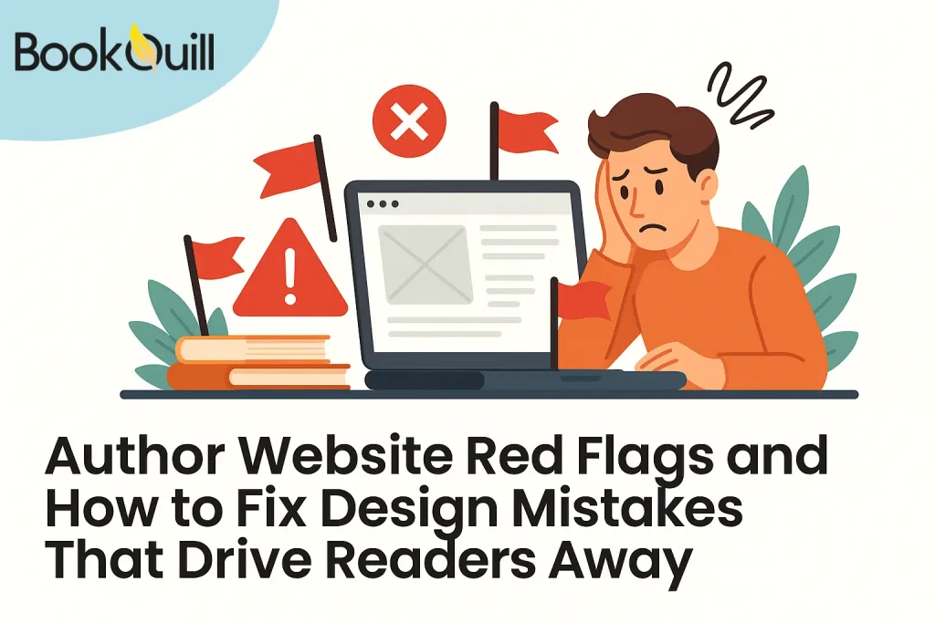
Author Website Red Flags and How to Fix Design Mistakes That Drive Readers Away
So, you’ve written your book, picked out the perfect cover, and finally launched your author website. That’s great – well done.
But here’s the thing most writers don’t realize: if your website doesn’t look good or feel right to visitors, they’re probably not going to stick around. And even worse? They might not come back.
Now, before you panic, understand that you don’t need to design some fancy, high-tech site that costs hundreds (or thousands) of dollars. A simple site is totally fine. It just needs to do one job really well: help readers feel connected to you and your work.
The problem? Many authors ignore small website design mistakes that drive people away.
I am talking about simple things like slow loading times, confusing menus, hard-to-read text… little things that add up and make your site feel frustrating instead of welcoming. Yes, those small things can actually hurt your credibility more than you’d think.
But don’t worry, that’s exactly what we’re here to fix. In this blog, we’ll walk through the most common design mistakes authors make, why they matter, and how to fix them without getting overwhelmed.
Because in the end, your website should sell you – not send readers running to someone else’s.
Key Takeaways
- Confusing Homepage: Keep your homepage simple with key info (name, genre, book cover, and one clear call-to-action).
- Hard-to-Read Fonts: Use 1-2 clear and readable fonts.
- No Dedicated Book Page: Always have a clear, easy-to-find page for your book with a quality cover, description, and purchase links.
- Missing Contact Info: Make it easy to contact you and find your “About” page.
- Mismatched Design: Your site should reflect your book’s genre and tone.
- Low-Quality or Random Images: Avoid blurry photos and stock images that don’t fit your brand.
- Slow Loading Time: Ensure your site loads fast and is easy to navigate.
Why Website Design Still Matters for Authors in 2025
You might think your book should do all the talking – and maybe it could. But today, that’s almost impossible. Wondering why? Because most readers are online now.
So, if your site has website design mistakes, people will leave without even checking out your book. That’s why mistakes in website design can quietly hurt your author brand without you realizing it.
People form opinions in just a second. A study found that 75% of users judge a business’s credibility based on how its website looks, and the same goes for authors. So, if your site is messy or confusing, readers might think your writing is, too.
Plus, agents, publishers, and media teams often visit author websites to learn more. If your site is broken or missing key info, it can send the wrong message – even if your book is great.
So having a clean design, easy navigation, and strong branding still matters. Next, we’ll go over the most common design problems authors make so you can avoid them and keep readers interested from the very first click.
Common Website Design Mistakes That Make Readers Click Away
1. Confusing or Cluttered Homepage
First impressions are very important, especially online. If your homepage tries to do too much, it can end up doing nothing at all. Imagine a reader visits your site and sees five fonts, ten colors, a welcome video auto-playing, and a blog post from 2017. What happens next? They leave.
One common mistake that (almost) every author makes is turning their homepage into a cluttered mess. Your homepage should be like a front door – simple, welcoming, and clear. You only need a few important things here:
- Your name and book genre
- A clear photo or logo (brand image)
- Your most recent (or best-known) book cover
- One clear action for visitors: “Buy Now,” “Read an Excerpt,” or “Join My Mailing List”
A great example is Neil Gaiman’s website. His homepage is clean, focused, and easy to use. Whether you’re a new reader or a fan, you know exactly where to go.
Keeping your homepage simple also helps with website SEO (search engine ranking). Google likes pages that load fast, are well organized, and are easy to use – and so are your readers!
2. Fonts That Are Hard to Read (or Too Many Fonts)
You might like a handwritten font that looks like your journal, or a typewriter style that fits your historical fiction. But if visitors have to squint to read your name or struggle to read your book description, your font is causing problems.
This is one of those quiet website design mistakes that might not seem important until you start losing readers because of it. Fonts shouldn’t distract from your message. They should make it easier to understand, not harder.
Here are some simple tips:
- Use only 1 or 2 fonts on your whole site.
- Don’t use very thin or fancy fonts for regular text.
- Make sure your font size is at least 16px so it’s easy to read.
- Check the colors, too. Don’t put light gray text on a white background.
Why does this matter? Studies show that how easy your text is to read affects how much people trust your site and how long they stay. And honestly, if they can’t read it, they won’t buy your book.
Using clear fonts also helps with strong author branding. It creates the right feel for your genre, whether you write cozy mysteries or dark thrillers.
3. No Book Page or Poor Book Layout
Believe it or not, some author’ websites don’t even have a proper page for their books. Even worse, some bury the book links three menus deep. If readers can’t find your book within seconds, you’ll lose sales.
This is one of those website design mistakes that directly hurts conversions. Your book page should be easy to find and simple to use. It should clearly show:
- A good-quality book cover (no blurry pictures)
- A short and clear description (like the back cover, not the whole story)
- A clear call-to-action button, like “Buy Now” or “Read a Sample”
- Links to where readers can buy your book (Amazon, Bookshop.org, Kobo, etc.)
Look at Colleen Hoover’s website; every book has its own clean, organized page with purchase links front and center. It’s designed for action, not confusion.
Remember, your website isn’t just about you. It’s your book’s storefront. So don’t hide your best product where no one can see it.
4. Missing Contact Info or About Page
Imagine this: A blogger wants to feature your book. A librarian wants to invite you to a local event. A reader wants to send you a nice message. They visit your website… but there’s no contact page, no email, and not even a simple form to reach you.
One of the easiest-to-fix website design mistakes is forgetting to tell people how to contact you, or making them search too hard for it.
However, your contact info should be just one click away – ideally in the main menu. Even better if you include:
- A contact form (quick and safe to use)
- A direct email (if you’re okay sharing it)
- Social media links that actually work
The same goes for your “About” page. Readers want to connect with the person behind the pages.
For About Page:
Keep your bio short, personal, and interesting. Share what you write, why you write it, and maybe a fun fact that makes you stand out.
These build trust, which is a key part of effective website design for authors. Plus, it shows professionalism, which matters if you ever want to land interviews, speaking events, or publishing deals.
5. Your Website Doesn’t Match Your Genre or Voice
Your website might work well and load fast, but does it feel like your book?
Many author websites miss this point. The content is okay, and the links work, but the style is all wrong. Imagine a horror writer’s site with soft pastel colors and fancy curly fonts, or a children’s author using dark, moody pictures. Readers will get confused quickly.
Your site should show your genre, tone, and style. This kind of branding mismatch is one of the tricky website design mistakes because it quietly pushes readers away, even if you don’t notice it yourself.
Here’s what to check:
- Are your colors, images, and typography aligned with your genre?
- Does the vibe of your homepage match the books you write?
- Is your author photo consistent with the tone you set in your writing?
For example, if you write cozy mysteries, your site should feel warm and friendly; if you write dystopian sci-fi, darker colors and a clean design work better. Many of the best author website design services offer themes made for different genres, for this reason.
Keeping your style consistent builds trust. When readers visit your site, it should feel like they’re stepping into your book, not somewhere random.
6. Bad Photos or Random Images Can Hurt Your Site
Author websites usually aren’t packed with images, but the ones you do use really matter. You may even wonder about it because it’s one of the most overlooked author website design mistakes. But it’s true that poor visuals can make your site feel less professional, even if everything else is solid.
Here’s what to avoid:
- Blurry or low-quality photos
- Random stock images that don’t fit your vibe
- A mix of styles that clash — like a black-and-white photo on one page, and bright cartoon art on another
Even if you’re just filling space, your images should still feel intentional. Think about your book’s themes or mood. Can you echo those in your visuals? You could even use your book cover as a style guide for colors or tone.
No pro author photos? No problem. Use high-quality, on-brand images from free sites like: Unsplash, Pixabay, and FreeImages.
Most importantly, keep it consistent. Your images should match the feel of your writing, not distract from it.
DIY Gone Wrong? Know When to Get Help
Building your own website is easier than ever, and for many authors, it’s a great first step. But there’s a big difference between a homemade site and one that looks truly professional.
If your website starts to feel more like a school project than a real author platform, it might be time to call in some help.
A common mistake? Not knowing when to stop tweaking things and ask a pro.
Here are some signs it might be time to hire an author website design service:
- Your site looks weird or broken on phones or tablets
- Pages are slow to load or crash
- Readers say they can’t find what they’re looking for
- You’ve spent hours trying to fix things — and it still doesn’t look right
Getting help doesn’t have to be pricey or stressful. There are small design studios that offer author website design services, with ready-made templates and support made just for writers.
If design isn’t your thing, that’s okay. Just focus on writing your book, and let someone else make your site shine.
Wrap-Up
Your author website doesn’t need to be fancy, but it does need to work. It should be clear, easy to use, and feel welcoming. Readers should be able to quickly see who you are, what you write, and where to buy your books.
The truth is, many authors have a few common website design mistakes: messy layouts, hard-to-read text, missing book details, slow loading, or visuals that don’t match the author’s brand.
The good news? These are all fixable, and often, small changes can make a big difference.
Think of your website as your online home. It’s where readers meet you when you’re not there in person. So, don’t let a confusing menu or cluttered page turn them away, okay?
Need a hand? There are some top author website design services made just for authors, whether you’re indie, self-published, or just starting out. You don’t have to do it all on your own.
Your stories deserve the spotlight. Let your website help them shine.
Frequently Asked Questions
Can a bad website hurt my book sales?
Yes, absolutely. A bad website can confuse readers, slow them down, or make your work seem less professional. If your site is hard to navigate or loads poorly, people are more likely to click away before even reading about your books.
What’s the best way to organize my author website navigation?
Keep it simple. Aim for 4 – 6 main tabs: Home, About, Books, Blog (optional), and Contact. Use clear words like “Books” instead of “My Work.” If readers can’t find your book within one or two clicks, they’ll leave. Think more like a bookstore, less like a portfolio.
How often should I update my author website?
You don’t need to tweak it weekly, but update it at least quarterly — or any time you:
- Release a new book
- Announce an event or tour
- Add a newsletter freebie
- Refresh your author photo
Keeping your site current shows readers (and search engines) that you’re active and present.
What are some signs that the author’s website design services are the best?
Look for providers who specialize in author platforms, not just general web design. The best ones understand what readers look for: fast loading, book pages, sign-up forms, and branding that fits your genre. Bonus if they include SEO support and ongoing updates.
Should I hire someone or use a DIY builder like Wix or Squarespace?
It depends on your skills and goals. DIY builders are great for quick setups, but if your site starts to feel off or too basic, it might be time to invest in professional help. You can reach out through an author’s website design services contact page and get quotes before committing.
About Author
Hi, my name is Zachary Stone I’m a book marketing nut — or, as I like to call myself, a “Shelf Marketer.” No, I don’t sell wooden shelves; I market the books that are left forgotten on them. If you want your book to be the next bestseller, I am your go-to person. I am here to remind you that it’s not just about writing a great story — it’s about building a buzz among people with great campaigns.